On this page
How it can help
Signage and other visual, tactile, sound, colour and light cues can help make spaces easier to get around. They can help or get in the way of how easily people figure out where they are, get around, or find their way from one point to another. When a space is set up well, it can help a child or young person feel more independent and safe.
What it is
Wayfinding
Wayfinding is the process of how people orient and navigate themselves in a space. It is a combination of graphic design, architectural design, and landscape design.
Wayfinding is the ability to:
- know where you are
- where you are headed and how to get there
- and how to recognise when you have reached your destination
- find your way out.
Wayfinding is problem solving and moving around space by using clues in an environment. These clues should be consistent. For example, lines on the ground can indicate a way out, or certain colours on the carpet can indicate an activity space. Good wayfinding design can minimise the need for signage.
Signage
Signage is a system of signs and graphics that helps people to get around a location or space.
Design features
Signage and wayfinding design features should be consistent at different sites. They are useful for children and students with disability. Consistent features help them to understand information and learn the patterns of the space, for instance, always having green illuminated signs for exits.
There are other things that designers and architects can do to make finding your way around easier.
Tactile Ground Surface Indicators (TGSIs)
Tactile Ground Surface Indicators (TGSIs) are patterns of bumps on the ground that can be felt with your feet. These can highlight changes in direction or provide warning indicators for hazards, for example at the bottom of stairs, at landings and at ramps.
To make access easier for everyone, the indicators need to be at least 30% brighter than the ground around them. Some kinds of indicators need to be 45% or 60% brighter.
TGSIs are necessary warning indicators, but good wayfinding design should mean they are needed less.
Colour and luminance contrasts
Colour and luminance contrasts make important features stand out. Colour contrast is the difference between two colours. Luminance contrast is the difference in how light and dark different surfaces are.
For many people with vision impairment, luminance contrast is very important in helping them recognise different parts of things in the built environment. They can be used inside or outside, for example with painted pathways, to indicate doorways, and for toilet seats and lids.
Accessible signage
Accessible signage is:
- to the point
- easy to read
- easy to understand.
Accessible signage must:
- be in at least 18-point font
- be able to be felt (tactile)
- display symbols, for example the international symbol for access or the international symbol of deafness and hearing loss
- display braille
- be at an appropriate height.


Logical pathways
Logical pathways help people find their way around a space. It’s important to be able to see a connection from where you are to where you are going.
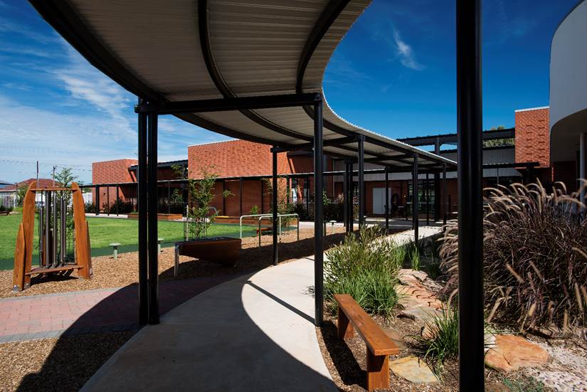
Level, covered outdoor walkways should have predicable paths or loops that return to the starting point. This can help people find their way.

Help to recognise specific areas
Specific areas in learning spaces can be shown by design features like colour, texture and symbol. A clear idea of what spaces are used for helps people to make their own choices about where they want to be. This helps each child and young person be more independent.
These are some examples of directional design features:
- areas with a glued-down tight-weave carpet for quiet reading and play
- linoleum areas for eating, cooking, art activities
- areas with more natural light for reading
- high ceilings for interactive activities where there is lots of movement, for example throwing a ball
- low ceilings for quiet, calm activities.
Directions – hints
Directional hints make it easier to find your way. They are physical clues that lead from one activity or area to another. They might also be physical support. Some examples are:
- footprints on the floor
- snake-like pathways
- handrails or hand supports
- clear edges along paths and building lines that are free of obstacles
- putting different colours on different buildings, levels or doors. sensory cues from different plants or landscape elements, such as herbs leading to the entry to the food technology building, and timber near the tech studies building.
This information was provided by the Ministerial Advisory Committee: Children and Students with Disability which ceased in 2019.
Contact
Asset Planning, Standards and Sustainability
For enquiries regarding design standards and technical specifications:
Phone: 8226 0717
Inclusive Teaching and Learning
For advice on inclusive legislation and policies:
Phone: 8226 0521
Email: education.DPP@sa.gov.au


